As we enter 2023, a fascinating fact comes to light: over 70% of homeowners think about color when updating their homes. This shows how important picking the right colors for our homes is. The interior design world is buzzing with new color trends that can change how we see our homes.
We’ll look at the top neutral colors, bold statement colors, soft pastels, and the latest accent colors. Knowing these trending home paint colors is the first step to making a space that’s both trendy and personal.
Key Takeaways
- The latest color trends for 2023 are transforming living spaces.
- Neutral colors remain a staple in interior design.
- Bold statement colors and pastel shades are gaining popularity.
- Trending accent colors can elevate the aesthetic of a room.
- Understanding color psychology is key to choosing the right hues.
Understanding Color Psychology in Home Design
Colors greatly shape our living spaces, affecting our mood and how we see things. The study of color psychology is complex. It looks at how colors influence our feelings and actions. In our homes, knowing this can help us pick colors that make our lives better.
The Impact of Colors on Mood
Different colors can make us feel different ways. Warm colors like red, orange, and yellow bring energy and warmth. On the other hand, cool colors like blue, green, and purple help us relax and feel calm. By choosing the right colors, we can make our homes better for our minds and feelings.
For example, a living room painted with a warm color can be a cozy spot for family. A bedroom with cool colors can help us sleep better. Knowing how colors affect our mood lets us design spaces that meet our needs.
How Colors Affect Space Perception
Colors also change how we see a room’s size and layout. Light colors make a room look bigger by bouncing light. Dark colors create a cozy feel by soaking up light. This is key for making spaces feel both big and welcoming.
Using light colors on walls and ceilings can make a room seem taller, making it feel bigger. Darker shades on walls can make a large room feel more intimate. By knowing how colors affect space, we can change how our rooms feel.
Top Neutral Colors for Modern Interiors
Neutral colors are leading the way in modern interiors. They offer a clean and elegant look for any decor. These colors are timeless and versatile, creating a sophisticated and welcoming space.
Timeless Appeal of Whites and Off-Whites
Whites and off-whites are top choices for their crisp look. They make rooms appear larger and brighter. Whites and off-whites are versatile and work well with any color, perfect for those who love to change their decor.
Elegant Grays: A Versatile Choice
Grays are favored for their sophisticated and elegant vibe. They range from light to dark, fitting various styles. Grays are versatile and balance both cool and warm colors, ideal for a balanced interior.
Beiges and Taupes: Warm and Inviting
Beiges and taupes add warmth and coziness to a room. They’re great for living rooms and bedrooms, focusing on comfort. They also pair well with wood and stone, adding an organic feel.
Using these neutral colors in your decor can give your home a stylish and timeless look. Whether you like the crispness of white, the elegance of gray, or the warmth of beige, there’s a neutral color for everyone.
Bold Colors Making a Statement in 2023
In 2023, bold colors are leading the way in home design. Neutral colors set the base, but bold colors add the real flair. They bring character and personality to our homes. These colors can change a space, stir emotions, and create a unique vibe.
Rich Blues: A Touch of Serenity
Rich blues are popular for adding calm to homes. These deep shades create a soothing atmosphere, great for bedrooms or meditation rooms. They also add elegance to kitchens and living rooms.
Vibrant Greens: Bringing the Outdoors In
Vibrant greens are a big trend in 2023. They bring nature indoors, making spaces feel fresh and natural. Green offers many options, from light mint to deep forest, for walls and furniture.
Deep Reds and Burgundies: A Dramatic Touch
Deep reds and burgundies are for those who want to make a bold statement. These rich colors add warmth and luxury. They’re perfect for dining rooms and living areas, making spaces cozy and inviting.
To use these bold colors, try them on accent walls, furniture, or accessories. This adds a splash of color without overwhelming the space. Feel free to mix different shades and combinations to match your style.
| Color | Atmosphere | Best Used In |
|---|---|---|
| Rich Blues | Calming, Sophisticated | Bedrooms, Kitchens, Living Rooms |
| Vibrant Greens | Fresh, Natural | Accent Walls, Furniture |
| Deep Reds and Burgundies | Warm, Luxurious | Dining Rooms, Living Areas |
Pastel Shades That Transform Spaces
Pastel shades are a big trend for 2023, making our homes feel soft and calm. They’re great for bedrooms, nurseries, and living rooms. These colors help create a peaceful vibe.
Soft Pinks: Instilling Calmness
Soft pinks add warmth and serenity to our homes. You can use them on walls, furniture, or as an accent. They’re perfect for feminine decor but also add sophistication to modern spaces.
Light Blues: Airy and Refreshing
Light blues are a popular choice for our homes. They remind us of clear skies and calm waters. This color is great for creating a relaxing feel. Pair it with whites or grays for an airy feel.
Gentle Yellows: Cheerful Accents
Gentle yellows add a cheerful vibe to our homes. They can brighten up neutral decor or make a space feel welcoming. Use them in kitchens, dining areas, or playrooms for a happy feel.
Here’s a table showing how different pastel shades can change our home decor:
| Pastel Color | Atmosphere Created | Ideal Rooms |
|---|---|---|
| Soft Pink | Warm, Serene | Bedrooms, Nurseries |
| Light Blue | Airy, Refreshing | Living Rooms, Bathrooms |
| Gentle Yellow | Cheerful, Optimistic | Kitchens, Playrooms |
Using pastel shades in our decor makes our spaces calm, inviting, and stylish. They’re versatile and can be used as main colors or accents. Pastel colors are a great way to improve our living areas.
Trends in Accent Colors for 2023
Accent colors are now a big deal in home decor for 2023. They add personality and depth to our homes. This year, we’re seeing colors like mustard yellow, jewel tones, and earthy hues becoming popular.
Mustard Yellow: A Pop of Warmth
Mustard yellow is a vibrant color that brings warmth and energy. It’s great for adding a pop of color through throw pillows, blankets, or furniture. For more ideas on using bold colors, see our guide to the best home interior paint colors.
Jewel Tones: Luxurious Undertones
Jewel tones like emerald green, sapphire blue, and amethyst add luxury. They create a dramatic look and add depth. “Jewel tones make a space feel rich and welcoming,” says an interior design expert. “They can be used to highlight a spot or cover the whole room.”
Earthy Hues: Connecting with Nature
Earthy colors like terracotta, sienna, and moss green are also trending. They bring the outdoors in and create a calm atmosphere. Pairing these colors with wood and stone adds to the natural feel.
When using these accent colors, balance them with your home’s colors. Start with small touches and add more as needed. This will help you achieve the right look.
The Rise of Biophilic Design Colors
The trend of biophilic design is now popular, bringing colors inspired by nature into our homes. As cities grow, our homes become more than just places to live. They become a connection to the earth. Biophilic design uses colors and elements from nature to make our homes sustainable and harmonious.

Greens Inspired by Nature
Greens are key in biophilic design, mimicking the colors of plants and trees. These colors can be used in many ways, like accent walls or furniture. They bring calm and renewal to our homes. Adding greens to your decor can be simple, like plants, or big, like painting a room green.
- Soft sage: Ideal for bedrooms, promoting relaxation.
- Emerald green: Adds a luxurious touch to living areas.
- Mint: Perfect for kitchens, offering a fresh and clean ambiance.
Natural Wood Tones and Textures
Natural wood tones are vital in biophilic design, adding warmth and texture. They can be hardwood floors, wooden furniture, or decorative pieces. Wood brings the outdoors inside, fitting every style, from rustic to modern.
Benefits of natural wood tones include:
- Adding warmth to a room.
- Creating a sense of connection to nature.
- Offering versatility in design, from traditional to contemporary.
Browns: Earthy and Grounding
Browns are essential in biophilic design, grounding our spaces and connecting us to the earth. These colors range from light beige to deep chocolate. They can be furniture, decor, or architectural elements, adding depth and coziness.
Some popular ways to incorporate browns include:
- Using wooden furniture with a natural finish.
- Adding brown leather accents.
- Incorporating earthy-toned ceramics and textiles.
By using biophilic design colors, homeowners can make spaces that are stylish and connected to nature. Whether through greens, wood tones, or browns, homes become welcoming, sustainable, and personal.
Popular Color Combinations for 2023
This year, 2023, brings a focus on balance and harmony in color schemes. The right color mix is key in interior design. It greatly impacts a space’s feel and function.
Monochromatic Schemes: Sleek and Sophisticated
Monochromatic schemes use different shades of one color. This makes a room look sleek and sophisticated. It also makes the space feel bigger and more unified.
For example, using various blues can create a calm and peaceful vibe. From light sky blue to deep navy, the effect is soothing.
Contrasting Palettes: Dynamic and Engaging
Contrasting palettes pair colors that are opposite each other on the color wheel. This creates a dynamic and engaging look. It adds energy to any room.
For instance, mixing warm beige with cool blue accents is striking. It grabs your attention and draws the eye.
| Color Scheme | Description | Example |
|---|---|---|
| Monochromatic | Different shades of the same color | Various blues from pale to navy |
| Contrasting | Colors opposite each other on the color wheel | Beige and blue |
| Harmonizing | Colors that are next to each other on the color wheel | Soft pink, mauve, and lavender |
Harmonizing Colors: Creating Flow
Harmonizing colors are next to each other on the color wheel. This scheme offers a smooth and natural flow. It makes a space feel more relaxing and welcoming.
For example, soft pink, mauve, and lavender make a soothing palette. It’s ideal for a bedroom.
By using these popular color combinations, homeowners can create a beautiful and personal space. It reflects their style and taste.
The Influence of Regional Styles on Color Choices
Exploring trending home paint colors shows us how regional styles shape our choices. Each area has its own color palette, influenced by its environment and culture.
Regional styles deeply impact our home design. The colors we pick often mirror the look of a region. Let’s see how different styles are shaping 2023’s color trends.
Coastal Color Inspirations: Blues and Whites
The coastal style is all about calm and freshness. It uses blues and whites to remind us of the sea and sand. This creates a peaceful vibe in homes.
“The color palette of a coastal home is designed to reflect the natural beauty of the ocean and the shore, with blues and whites being central to this aesthetic.”
Some top coastal color combos include:
- Soft blues with crisp whites
- Seafoam greens and sandy neutrals
- Navy blues with coral accents
Rustic Farmhouse Aesthetics: Earthy Tones
Rustic farmhouse styles are warm and cozy. They use earthy tones like brown, green, and tan. These colors are inspired by nature.
| Color | Description |
|---|---|
| Earthy Browns | Warm and inviting, like soil and wood |
| Mossy Greens | Soft and calming, from the natural world |
| Sandy Tans | Neutral and warm, capturing farmhouse charm |
Urban Chic: Sleek Grays and Pops of Color
Urban chic interiors are sleek and modern. They use grays and bold colors. This style is great for those who love a contemporary look.
- Sleek grays as the main color
- Bold colors through furniture or decor
- Metallic accents for sophistication
Knowing how regional styles influence color choices helps homeowners. They can choose colors that reflect their style and the unique feel of their home.
Choosing the Right Color for Every Room
The right color scheme can change your living space. It’s key to pick colors that fit each room’s purpose. This makes the room both functional and cozy.

Living Rooms: Warmth and Welcoming
Living rooms are where we bond with loved ones. Warm colors make them cozy. Think about using beige, taupe, or soft grays for a comfy vibe.
Interior designers say warm colors make rooms feel cozy and inviting.
For a modern twist, add deep blues or greens as highlights. They bring depth and interest.
Kitchens: Energy and Creativity
Kitchens need energy and creativity. Bright colors boost appetite and energy. Yellow, orange, or red are great for kitchens.
But, mix these bold colors with neutral shades to keep the space balanced.
“The kitchen is the heart of the home, and its color scheme should reflect warmth and vitality.” –
Bedrooms: Calm and Relaxing
Bedrooms are our retreats. They need calming colors for rest. Soft blue, lavender, or pale green shades are perfect for peace.
- Soft blues and whites for calm
- Pale greens for a natural feel
- Lavender for a soothing vibe
Choosing the right colors for each room makes your home beautiful and comfy. Pick popular wall colors and best home color schemes that match each room’s purpose and feel.
Sustainability in Color Selection
Choosing colors for our homes is key to a greener future. The paint industry is now focusing on eco-friendly options. This shift is due to people wanting healthier, more sustainable living spaces.
When picking colors, the type of paint matters a lot. Traditional paints can harm our air and the planet. But, eco-friendly paints are now available. They’re good for the environment and our health.
Eco-Friendly Paint Options: Healthier Choices
Eco-friendly paints use natural ingredients and have fewer VOCs. This makes them a better choice for our homes. They’re free from harsh chemicals, which helps keep our air clean.
Some top eco-friendly paint brands include:
- Farrow & Ball
- Benjamin Moore’s Natura
- Behr’s Premium Plus Low-VOC
Non-Toxic, Low-VOC Paints: Safe for Our Homes
Non-toxic, low-VOC paints help keep our air clean. They’re great for homes with kids, pets, or people who are sensitive. These paints are designed to reduce indoor air pollution.
| Paint Type | VOC Level | Health Benefits |
|---|---|---|
| Traditional Paint | High | None |
| Eco-Friendly Paint | Low | Reduces indoor air pollution |
| Low-VOC Paint | Very Low | Minimizes health risks |
By picking eco-friendly and non-toxic paints, we make our homes healthier. We also help create a more sustainable future.
Tips for Testing Colors in Our Spaces
Choosing the right color is more than just picking a shade you like. It’s about making sure it fits well in your home. We often imagine how a color will look on our walls. But, the real thing can be different.
That’s why it’s key to test colors before making a final choice.
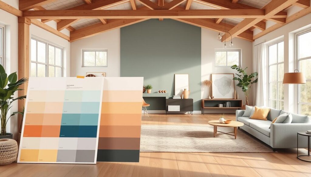
Sample Swatches: Visualizing in Natural Light
Using sample swatches is a great way to test colors. These swatches let us see how the color looks in our lighting. Natural light can change how a color appears, so it’s important to check the swatches at different times.
- Paint small sections of the wall with the color you’re considering.
- Observe the color at different times of the day to see how it changes in various lighting conditions.
- Take note of how the color looks against your furniture and decor.
Considering the Color Flow: Creating Cohesion
Another important thing is thinking about the color flow in your home. Color flow is how colors move from one room to another. A good color flow can make your home feel cohesive and harmonious.
| Room | Color | Effect |
|---|---|---|
| Living Room | Warm Beige | Creates a welcoming atmosphere |
| Kitchen | Soft White | Makes the space feel clean and airy |
| Bedroom | Calming Blue | Promotes relaxation and rest |
By thinking about color flow and testing with swatches, we can pick colors that work well in our space. This way, our home will be harmonious and inviting.
Conclusion: Embracing the Popular Colors of 2023
This year, we’ve seen a wide range of colors that can make any home look great. These colors are perfect for anyone, no matter their style.
Personalizing Your Space
Choosing colors for our homes is more than just following trends. It’s about making our spaces reflect who we are. The colors of 2023 give us many options to do just that.
Creating a Welcoming Atmosphere
Using these color trends, we can make our homes feel warm and inviting. Whether you like calm colors, bold ones, or soft pastels, the right choice is one that shows our unique style.
By embracing these colors, we can make our homes truly reflect our personalities. They will be stylish and meaningful, showing off who we are.

