A well-designed space can greatly impact our mood and productivity. Did you know that a unified color palette is crucial in creating a harmonious atmosphere?
We believe that a thoughtful interior design can transform a house into a home. By choosing a cohesive color scheme, you can create a sense of visual flow throughout your space.
At our core, we’re dedicated to helping you discover the perfect home interior color schemes to suit your style.
Key Takeaways
- Understand the importance of a unified color palette in interior design.
- Learn how to create a cohesive color scheme throughout your space.
- Discover the impact of color on your mood and productivity.
- Get tips on choosing the right interior design color palette for your style.
- Explore the benefits of a well-designed home with a harmonious color scheme.
Understanding the Importance of Color in Home Interiors
Color in home interiors is very important. It affects our mood, behavior, and well-being. Choosing colors for our homes is more than picking a palette. It’s about creating an atmosphere that influences how we feel and interact in our spaces.
Creating a whole house color palette makes choosing paint easier. It ensures our homes look cohesive and feel harmonious. This makes moving from room to room smooth and enjoyable.
How Color Affects Mood and Atmosphere
Colors deeply impact our emotions and the feel of a room. Warm colors like red, orange, and yellow bring warmth and energy. Cool colors like blue, green, and purple calm us down. When choosing paint colors for home, think about the mood you want in each room.
Here’s a simple look at how colors can change the mood and feel of different rooms:
| Color | Mood/Atmosphere | Suitable Rooms |
|---|---|---|
| Warm Red | Energizing, Cozy | Living Room, Dining Room |
| Soft Blue | Calming, Serene | Bedroom, Bathroom |
| Bright Yellow | Uplifting, Happy | Kitchen, Playroom |
The Psychology Behind Color Choices
The psychology of color choice is complex. It’s shaped by personal experiences, culture, and individual tastes. When picking popular home color schemes, knowing the psychological effects of colors is key.
Green is often linked to nature and balances our emotions. It’s great for many rooms, from living areas to bedrooms. Neutral colors like beige, gray, and white offer a clean, timeless look. They’re perfect for showing off bold accent colors.
By knowing how colors affect us, we can design homes that are not just beautiful. They also improve our well-being.
Popular Color Trends for Home Interiors
Our homes show who we are, and color trends help us express ourselves. Color is key in making our homes feel like us.
Our color experts picked paint colors that fit the latest trends. They help make any room in your home look great.
Earth Tones: Embracing Nature
Earth tones are popular for bringing nature inside. Colors like terracotta and sage green make rooms calm and natural. “Earth tones add warmth and coziness, great for living rooms and bedrooms,” says a top designer.
Using earthy colors makes your space feel peaceful and welcoming. It’s like having a piece of nature in your home.
Bold Colors: Make a Statement
Bold colors are for those who want to stand out. Colors like deep blues and bright yellows add energy and personality. Benjamin Moore’s Color of the Year shows bold colors are a way to show your style.
Soft Pastels: A Calm Retreat
Soft pastels are for those who want a calm space. Colors like pale pink and baby blue are soothing. They’re perfect for bedrooms and nurseries.
In short, today’s color trends offer many choices for any style. Whether you like earthy tones, bold colors, or soft pastels, there’s something for everyone.
Choosing the Right Color for Each Room
Choosing the right color for each room is key to a harmonious home. Different rooms have different uses, and the color affects the feel and function of each space.
Living Room: The Heart of the Home
The living room is where we spend most of our time. It’s for watching TV, reading, or entertaining guests. So, the color should be inviting and comfortable.
Warm colors like beige, brown, or taupe make it cozy. Cool colors like blue or green can make it feel spacious and calm.
Think about your furniture and decor when picking a color. You want the color to match these elements for a cohesive look. For example, a lighter wall color can balance dark furniture.
Kitchen: A Space for Creativity
The kitchen is more than just for cooking; it’s where family and friends gather. The color scheme affects the mood and energy. Bright and cheerful colors like yellow or orange can boost appetite and conversation. Soft colors like white or light gray can make it feel clean and modern.
Consider your kitchen’s cabinets, countertops, and appliances when choosing a wall color. You want a color that complements these elements. For instance, a lighter wall color can contrast nicely with dark cabinets.
Bedroom: A Sanctuary for Rest
The bedroom should be a place to relax and unwind. The color you choose can greatly affect your ability to rest. Soft, calming colors like light blue, pale green, or lavender promote relaxation and sleep. Avoid bright or bold colors that might stimulate rather than calm the mind.
Think about the mood you want in your bedroom. Soft reds or purples can create a romantic ambiance. For a serene atmosphere, consider soft neutrals or pastels.
To help you visualize different color combinations for your home, here’s a simple guide:
| Room | Recommended Colors | Effect |
|---|---|---|
| Living Room | Warm beige, Soft blue | Cozy, Calming |
| Kitchen | Bright yellow, Clean white | Stimulating, Modern |
| Bedroom | Light blue, Pale lavender | Relaxing, Soothing |
By considering each room’s purpose and decor, you can choose colors that enhance both looks and function. The right color combinations can significantly improve how you feel at home.
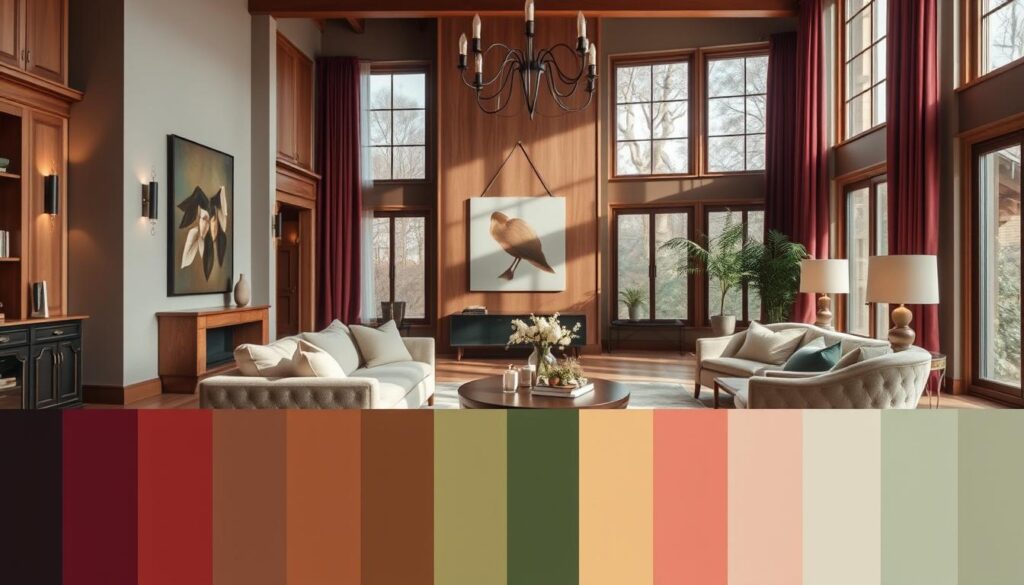
Creating a Cohesive Color Palette
The key to a beautiful home interior is choosing a cohesive color palette. This palette should flow smoothly from room to room.
Creating a cohesive color palette is key for a harmonious home. A well-chosen color scheme can make your home look welcoming and stylish. We’ll look at how to harmonize colors and pick accent colors that make a statement.
Harmonizing Colors Throughout Your Home
To get a cohesive look, pick a few colors that work well together. A typical whole house color palette has six or seven colors. This includes a main color, secondary colors, a trim color, and an accent color. This ensures your home feels connected and harmonious.
When picking colors, think about how they flow from room to room. Use a consistent main color throughout, but vary secondary colors in each room. For example, use a soothing blue as your main color, with different shades of green and yellow in various rooms.
Choosing Accent Colors for Impact
Accent colors add depth and interest to your space. They can be furniture, decor, or accessories. Choose an accent color that complements your main and secondary colors. For instance, a calm beige main color can be paired with a bold red or vibrant turquoise accent.
| Room | Dominant Color | Secondary Color | Accent Color |
|---|---|---|---|
| Living Room | Soft Beige | Warm Gray | Bold Red |
| Kitchen | Soft Beige | Crisp White | Bold Red |
| Bedroom | Soft Beige | Light Blue | Gold |
“Color is a crucial element in the design of a space, as it has the power to influence our emotions and perceptions.”
To see a cohesive color palette, look at the image below. It shows how different rooms can be connected with a consistent color scheme.
By harmonizing colors and choosing accent colors wisely, you can make your home beautiful and cohesive. The key is to balance consistency with creativity. This way, your home will feel connected yet uniquely expressive.
Utilizing Color Schemes to Enhance Space
Color schemes are key to making our homes feel bigger or cozier. The right colors can change how we see a room’s size and feel.
Light Colors for Smaller Rooms
Light colors on walls and ceilings make small rooms look bigger. Light colors reflect light, making rooms feel airy. Soft whites, creams, and pale grays are great for small rooms.
- Soft whites and creams make ceilings seem higher.
- Pale grays and blues add calmness and make rooms feel larger.
- Pastel shades add color without overwhelming the space.
Dark Colors for Added Drama
Dark colors, on the other hand, add coziness to big rooms. Dark shades create warmth and intimacy, making large spaces feel welcoming. Deep blues, rich greens, and warm browns are perfect for cozying up big rooms.
- Deep blues add luxury and sophistication.
- Rich greens bring a natural, earthy vibe.
- Warm browns add warmth and coziness, making rooms feel more inviting.
Choosing between light and dark colors depends on the room’s natural light and purpose.
By picking the right color scheme, we can improve our home’s feel. Whether we want a small room to look bigger or a large space to feel cozy, the right colors make a big difference.
The Role of Lighting in Color Perception
Lighting is crucial in how colors look in our homes. It’s not just about the color itself. The lighting conditions also play a big part.

Natural Light vs. Artificial Light
Natural light and artificial light change how we see colors. Natural light, with its full spectrum, is often the most accurate. But, it changes throughout the day, affecting color appearance.
Artificial lighting, like incandescent bulbs, can make colors look warm. LED bulbs, on the other hand, offer a cooler, neutral light. Knowing these differences helps pick the right colors for your home. Check out the best colors for home interiors.
Best Practices for Testing Colors
To pick the right color, test it under different lights. Here are some tips:
- See how the color looks at different times of day.
- Use samples or swatches on walls for a real view.
- Test the color under various artificial lights.
By following these steps, you can choose the best colors for your home’s interior design.
| Lighting Type | Effect on Colors | Best For |
|---|---|---|
| Natural Light | Provides a full spectrum, accurate color representation | Daytime color assessment |
| Incandescent Bulbs | Casts warm tones, can make colors appear more yellow | Cozy, warm spaces |
| LED Bulbs | Cooler, more neutral light, can make colors appear more vibrant | Task-oriented areas, modern decor |
Knowing how lighting affects color perception is key to a harmonious home. By considering both natural and artificial light, you can pick colors that look great in any light.
Tools for Selecting Interior Colors
Finding the perfect colors for your home is now easier, thanks to new tools. Choosing the right colors can change how your home feels. We have many tools to help us pick the best colors.
Color Swatches and Samples
Color swatches and samples are great for picking colors. They let us see how colors look in our home’s light. We can order samples to try colors before deciding.
Using swatches and samples has many benefits. They help us pick colors that match our home’s look. Here are some key advantages:
- See how the color looks in different lighting conditions.
- Compare the color with your existing décor.
- Make a more informed decision.
Online Color Visualizers
Online color visualizers are also helpful. They let us upload a photo of our room and try different colors. This way, we can see how colors will look before choosing.
Some popular online color visualizers include:
| Tool | Description | Features |
|---|---|---|
| ColorSnap | A tool by Sherwin-Williams that allows users to visualize colors on their walls. | Upload a photo, select colors, and see the results. |
| Visualizer | Behr’s color visualizer tool that helps users choose the perfect color. | Room visualizer, color matcher, and shopping list creator. |
| Color Picker | A tool by Valspar that enables users to test colors virtually. | Color matching, room visualizer, and color trend information. |
With these tools, we can choose colors that make our home better. Whether we like trying colors with swatches or using online tools, there’s something for everyone.
Incorporating Textures and Patterns
Home decor is more than just colors. Adding textures and patterns makes a space inviting and interesting. It’s all about mixing different elements to create depth and visual appeal.
Textures change how a room feels. Smooth surfaces like glass and metal make a room sleek. But, rough textures like wood and stone add warmth. Pairing bold colors with neutral textures creates a nice contrast.
Balancing Colors with Texture
Choosing the right textures for your colors is key. For example, a blue room looks better with natural textures like woven baskets. This adds warmth and depth.
Here are some tips for balancing colors with texture:
- Mix smooth and rough textures for interest.
- Use texture to add depth to a single-color room.
- Pair bold colors with neutral textures to avoid overwhelming the space.
Patterned Decor to Complement Color Schemes
Patterns are also important in home decor. They add interest, create focal points, or tie a room together. Choose patterns that match or enhance your color scheme.
For example, geometric patterns are modern and go well with bold colors. Floral patterns add elegance to softer colors.

| Texture/Pattern | Description | Complementary Color Scheme |
|---|---|---|
| Jute Rug | Natural, earthy texture | Earth tones, neutral colors |
| Geometric Patterned Throw | Modern, bold pattern | Bold, bright colors like red, orange |
| Velvet Sofa | Luxurious, soft texture | Rich, jewel-toned colors like emerald green |
By mixing textures and patterns, we can make a space that’s both beautiful and reflects our style.
Seasonal Color Changes for Home Interiors
Seasonal color changes are a great way to refresh your home’s look. By using seasonal colors, your space stays modern and inviting all year.
Refreshing Your Space with Seasonal Palettes
Changing your home’s colors with the seasons is easy. You can add new pieces or repaint rooms. For example, spring is the time for light, bright colors like pastels or whites. Winter calls for warm, cozy tones like rich reds or deep greens.
When picking colors, think about how they’ll fit with your decor. Consider the mood you want in each room. For instance, a soft blue is great for a summer bedroom. A bold orange can make a fall living room cozy.
“The right color can transform a room, making it feel entirely new and inviting.”
Tips for Easy Seasonal Decor Updates
To update your decor easily, start small. Here are some tips:
- Swap out throw pillows and blankets for new colors.
- Use seasonal flowers or plants for a color boost.
- Change your wall art or decorative items to match the season.
For bigger changes, like repainting, test colors with samples first. This helps ensure the color looks good in your space, under different lights.
Embracing seasonal colors keeps your home looking great. It also makes your home welcoming, showing off the current season.
Professional Help vs. DIY
Choosing the right interior design color palette can be tough. Many wonder if they should get help from a pro or do it themselves. The choice between hiring an interior designer or going DIY can really change how your home looks.
Every homeowner is unique. If you want a color scheme that flows well throughout your home, getting professional help might be best. But, if you’re on a budget and want something personal, DIY could be the better choice.
When to Consult an Interior Designer
Getting an interior designer is smart in some cases. For example, if your home’s design is complex or you’re not sure about colors, a pro can guide you. They can also help you spend your money wisely on a fancy interior design project.
| Situation | Benefit of Consulting an Interior Designer |
|---|---|
| Complex Architectural Design | Expert guidance on choosing colors that complement the design |
| Uncertainty about Color Choices | Personalized recommendations based on your home’s style |
| High-End Interior Design Project | Maximizing your budget with professional expertise |
DIY Tips for Choosing Colors
If you choose to DIY, here are some tips. First, think about your home’s natural light and how it affects color. You can also use online tools or paint swatches to try out colors before deciding.
Need more help picking colors? Consider a Virtual Color Consultation with one of our experts. They can give you personalized advice to find the perfect interior design color palette for your home.
Conclusion: Your Perfect Color Scheme Awaits
We’ve looked into home interior color schemes and why they matter. You now know how to pick colors that make your home look great. This knowledge helps you create a space that’s both beautiful and harmonious.
Confidence in Your Color Choices
Start choosing colors with confidence. Pick colors that show off your personal style. Think about natural light, texture, and pattern to make your color palette work well together.
Embracing Your Unique Style
Home interior color schemes set the mood of your home. We encourage you to try different colors to find what works best for you. Your home will show off your unique style, whether you choose trendy colors or classic ones.

