Did you know the right color scheme can boost your home’s value by up to 5%? A well-chosen home interior is not just pretty; it’s also smart financially. Picking the perfect color palette is key to a space that looks great and works well.
We’re diving into interior design to show you how to pick a color palette that changes your space. We’ll cover the newest interior color trends and classic design rules. You’ll learn how to make a home that shows off your style.
Key Takeaways
- Understand the importance of a well-designed color palette for your home interior.
- Learn how to choose a color scheme that increases your property value.
- Discover the latest interior color trends to inspire your design.
- Explore key elements to consider when selecting a color palette.
- Transform your space with a beautiful and functional color scheme.
Understanding the Importance of a Color Palette
Colors are key in home design, affecting how a space looks and feels. A good color palette can make a room feel welcoming and cozy.
In home decor, a color palette is very important. It’s not just about picking colors that match. It’s about creating a space that shows your personality and style.
Why Color Matters in Home Design
Color is a basic part of home design. The right colors can make a room seem bigger, cozier, or more lively. For example, light colors can make a room look bigger, while dark colors can add warmth.
Colors also affect our mood and actions. Blue can make us feel calm, which is great for bedrooms. Red can make us hungry, which is why it’s often used in dining rooms.
Psychological Effects of Colors
The effects of colors on our minds are important in color psychology in home decor. Different colors can make us feel different emotions. Knowing this can help you pick colors that look good and make us feel better.
| Color | Psychological Effect | Ideal Room |
|---|---|---|
| Blue | Calming, Serene | Bedroom |
| Red | Stimulating, Energetic | Dining Room |
| Green | Balancing, Refreshing | Living Room |
Enhancing Functionality Through Color
Colors can also make a room more functional. For example, a bold color can make a certain area stand out. This can guide our eyes and make the space more interesting.
When picking colors, think about the room’s purpose and what happens there. This helps you choose colors that are not only beautiful but also practical. It gives you home color inspiration that works well.
By carefully choosing colors, you can make a space that is both beautiful and useful. It will show your style and meet your needs.
Key Elements to Consider When Choosing Colors
The colors you pick for your home can change how it looks and feels. It’s important to think about how they work together. This creates a welcoming and harmonious space.
Room Purpose and Function
The room’s purpose affects its color choice. Bedrooms need calming colors for relaxation. Home offices might need energizing colors to help you stay focused. Knowing the room’s purpose helps pick the right house color combinations.
Natural Light and Its Influence
Natural light changes how colors look in a room. A color might look great in bright light but not in dim light. So, think about the room’s light when picking popular interior paint colors. This way, colors will look good all day.
Size and Layout of the Space
The room’s size and layout also matter. Light colors can make small rooms seem bigger. Dark colors can make large rooms cozy. Think about the room’s layout and furniture when choosing colors. A color palette generator can help see how colors will fit together.
By thinking about the room’s purpose, light, and layout, you can pick colors that look good and make your home more functional.
Popular Color Trends for Home Interiors in 2023
In 2023, we’re seeing a mix of earthy tones, bold colors, and soft pastels in home design. These trends give homeowners many options to update their spaces. It’s easier to find a style that’s both trendy and personal.
Earthy Tones
Earthy tones are big in interior design, adding warmth and coziness. Colors like terracotta, sienna, and moss make spaces feel welcoming. These natural hues look great and make us feel good too.
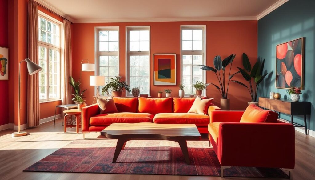
Bold Accents
Bold accents are perfect for making a statement. Colors like emerald green, navy blue, and mustard yellow add excitement to rooms. When used right, they make rooms stand out, sparking conversations and drawing eyes.
Soft Pastels
Soft pastels are also trending in home interiors. Shades of pink, lavender, and mint create calm, soothing spaces. They’re great for bedrooms and bathrooms, helping us relax and unwind.
Using these color trends in your home can give it a fresh, modern look. Whether you like earthy tones, bold colors, or soft pastels, there’s something for everyone. You can express your style and make your home truly yours.
Creating a Cohesive Color Scheme
A well-designed color palette can make your home look better and feel welcoming. There are many ways to create a cohesive color scheme, each with its own benefits.
Monochromatic vs. Complementary Colors
Using a monochromatic color scheme means using different shades of the same color. This makes a space feel connected and can make it look bigger. On the other hand, complementary colors add contrast and interest. For example, blue and orange together create a lively atmosphere.
Choosing between monochromatic and complementary colors depends on the mood and function you want. Monochromatic schemes are great for a calm, peaceful space. Complementary colors bring energy and excitement.
The 60-30-10 Rule of Color
The 60-30-10 rule is another good strategy. It says 60% of the room should be one color, 30% another, and 10% an accent color. This balance keeps the space from feeling too busy and makes colors work well together.
For example, in a living room, you might use blue as the main color (60%), white as the secondary (30%), and gold as the accent (10%). This mix adds depth and looks good together.
Tips for Mixing Patterns and Textures
Mixing patterns and textures adds depth and interest. Start with a neutral base and add patterns through furniture, rugs, and accessories. For instance, a leather sofa, a woven rug, and patterned pillows can create a rich look.
When mixing patterns, pick a color that ties everything together. This color should be in your palette and appear in different patterns. This way, you create a space that looks cohesive and reflects your style, offering home color inspiration for years.
By following these tips and exploring color scheme ideas, you can make a beautiful, cohesive color palette for your home.
Drawing Inspiration for Your Color Palette
Looking to make your living space better? Drawing inspiration from many places can help you create a color palette that’s all your own. It’s important to be open to different ideas to make your home unique and inviting.
Nature and Its Colors
Nature is full of color inspiration. Think about the greens of a forest, the bright colors of a sunset, or the soft colors of a flower garden. For example, the calm blues and greens of a lake can inspire a peaceful bedroom color scheme.
Seasons change, and so does nature’s color palette. Spring brings fresh greens and flowers, while autumn offers warm oranges and reds. By watching these changes, you can create a color scheme that shows your taste and connects with nature.
Art and Design Resources
Art and design can also inspire your home’s colors. Visit art galleries, check out design books, or explore Pinterest. For instance, an Impressionist museum might inspire soft colors, while a modern art gallery could suggest bold ones.
Websites like Havenly and Ouma Atelier offer insights and trends in home design. They help you keep up with the latest interior color trends.
Online Tools and Color Generators
In today’s world, online tools and color generators are very helpful. They let you try out different colors and see how they look together. A color palette generator can make it easier to find the right colors for your home.
There are many online tools and apps for creating and saving color palettes. They help you see how colors work together and make choosing colors easier.
By using these tools and sources, you can create a color palette that shows your style and makes your home more beautiful and functional.
Practical Tips for Testing Colors
Finding the right colors for your home is key. It’s all about testing colors to match your style and needs.
Sample Swatches and Test Areas
Testing colors with swatches and test areas is a smart move. It shows how colors look in real life and under different lighting conditions.
- Buy small paint samples to test on your walls.
- Paint different parts of the room to see how it looks at different times.
- Check how the color looks in natural and artificial light.

Lighting Considerations
Lighting greatly affects how colors appear in your home. Think about both natural and artificial lighting when testing colors.
- Test colors at different times to see how they look in natural light.
- Think about how artificial lighting changes the color.
- Remember, lighting changes throughout the day and year, so test colors under various conditions.
Timing Your Decisions
When you test colors, timing matters. Colors can change with the day and season.
Tips for Timing Your Decisions:
- Test colors over time to see how they look in different lights.
- Check how the color looks during the day and at night.
- Take your time to make sure you’re happy with your color choice.
By following these tips, you can pick colors that make your home look great. Choose popular interior paint colors and house color combinations that show off your style.
Common Mistakes to Avoid
Creating a harmonious color scheme can be tricky. Knowing common pitfalls helps a lot. When picking a color palette for your home interior, some mistakes can ruin the look.
Overloading with Too Many Colors
Too many colors can make a space look chaotic. It’s key to stick to a few main colors. Here’s how to keep your color scheme balanced:
- Choose a main color and use it everywhere.
- Pick one or two colors to go with the main one.
- Add neutral colors like white, beige, or gray for balance.
Ignoring Flow Between Rooms
When designing a color scheme for your home, think about room flow. A bad color scheme can make your home feel split. To keep things flowing well, do this:
- Keep the same color scheme in every room.
- Choose colors that go well together.
- Follow the 60-30-10 rule: 60% main color, 30% secondary, 10% accent.
Underestimating the Power of Neutrals
Neutrals are often ignored, but they’re crucial. Colors like beige, gray, and white help a lot. They:
- Balance out bold or bright colors.
- Make the space calm.
- Let decorative items stand out.
By avoiding these common mistakes, you can make a stunning color scheme for your home.
How to Refresh an Existing Color Palette
Refreshing your home’s color palette is easy. You can update a few key elements to change your home’s look. We have tips to help you find the perfect home design color schemes for your space.
Seasonal Updates
Seasonal updates can refresh your color palette. Change throw pillows, blankets, and decor to match the season. For example, use lighter colors in spring and summer, and warmer tones in fall and winter.
- Update throw pillows and blankets seasonally
- Choose colors that reflect the current season
- Consider interior home decor ideas for inspiration
Quick Fixes for a New Look
For a quick change, try a few simple updates. Paint one accent wall in a bold color or rearrange your furniture. These changes can make a big difference.
- Paint one accent wall in a bold new color
- Rearrange your furniture for a fresh layout
- Add new lighting fixtures or table lamps
Incorporating Accessories and Decor
New accessories and decor can refresh your color palette. Add vases, decorative objects, or artwork in colors you like. Update curtains or rugs for new hues and textures.

These strategies can give your home a new look without a big renovation. Whether for a new season or a new interior color trend, we hope these tips help.
Seeking Professional Help
Creating the perfect color palette for your home can be tricky. Sometimes, getting help from a pro makes all the difference. They can offer insights into color psychology in home decor.
Expert Guidance for Your Color Scheme
A color consultant or interior designer can be a game-changer. They help you pick a color scheme that looks great and works well. They’ll suggest ideas that fit your style and needs, making sure your home looks just right.
Benefits of Professional Color Consultation
Experts can steer you clear of common mistakes. They ensure your home looks cohesive. Working with them, you’ll learn how to use color in your decor effectively.
Tips for Effective Collaboration
To work well with a professional, bring your ideas and inspirations. This helps them understand your vision. They can then guide you to create a color palette that shows off your style.

