Choosing the right interior colors for your home can be tough. But it’s key to making your home feel welcoming. The colors you pick greatly affect how your home looks.
Did you know the right colors can boost your mood and change how you see your rooms? With so many choices, it’s easy to feel lost. In this guide, we’ll help you pick the best modern home interior colors to make your home’s atmosphere better.
Key Takeaways
- Understand the impact of color on your mood and space perception
- Learn how to choose a color palette that complements your lifestyle
- Discover the latest trends in contemporary home color palettes
- Get tips on how to balance bold colors with neutral tones
- Find out how to create a cohesive look throughout your home
Understanding Modern Home Color Trends
In the world of modern interior design, color trends are key. They shape the feel of our homes. Knowing the latest trends helps us make our spaces stylish and welcoming.
Definition of Modern Home Colors
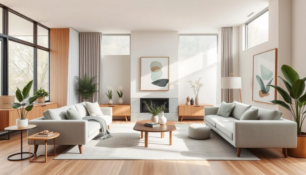
Modern home colors are simple, elegant, and versatile. They mix calm and stimulating qualities, ideal for today’s homes. Neutral tones like whites, grays, and beiges are common. They offer a clean base for any decor.
These colors are not just pretty; they’re practical too. They let homeowners update their spaces without big changes. By using popular interior color trends, you can make your home look fresh and modern.
Impact of Color Psychology on Design
Color psychology is crucial in modern design. Different colors can make us feel different ways. Cool colors like blues and greens calm us, while warm colors like oranges and reds energize us.
Knowing how color psychology works helps us pick the right colors for our homes. We can choose colors that fit each room’s purpose. For example, a bedroom might need soothing colors for relaxation, while a home office might need stimulating colors to boost focus.
By thinking about color psychology, we can create homes that are both beautiful and functional. Our homes can reflect our style and meet our needs.
Popular Color Palettes for Modern Interiors
Choosing the right color palette is crucial in modern interior design. It can transform your home, making it look cohesive and welcoming.
Neutrals: Timeless Choices for Any Space
Neutral colors are essential in modern design. They offer a clean look that works well with any furniture and decor. White, beige, and gray are favorites because they’re versatile and match many styles.
Here are some top neutral color combos:
- Soft gray walls with crisp white trim
- Warm beige with rich wood accents
- Monochromatic white schemes
| Color Combination | Description | Ideal Room |
|---|---|---|
| Gray and White | Soft gray walls with crisp white trim | Living Room, Bedroom |
| Beige and Wood | Warm beige tones with rich wood accents | Kitchen, Dining Room |
| Monochromatic White | Various shades of white for a cohesive look | Any Room |
Bold Accents: Adding Personality to Your Home
Neutral colors set the stage, but bold accents bring personality. Vibrant colors in furniture, rugs, or decor add interest and depth.
Here’s how to add bold touches:
- Use a brightly colored rug in a neutral room
- Add bold-hued throw pillows and blankets
- Feature a statement piece in a vibrant color
By mixing neutral backgrounds with bold accents, you can create a chic home. Experimenting with colors helps you find the perfect mix for your space. This way, your home will be both inviting and stylish.
How to Choose Colors Based on Room Function
The color scheme for your home should match each room’s purpose. Different rooms have different uses, and the right colors can improve their function and feel.
Living Rooms: Creating a Welcoming Atmosphere
Living rooms are the heart of the home, where families and guests spend time. Use warm and inviting colors like beige, soft grays, or taupe. These trendy wall colors for homes make your living room cozy and welcoming.
For a modern vibe, add bold accent colors like deep blues or rich greens. These colors bring depth and personality to your living room, making it lively for socializing.
Bedrooms: Promoting Relaxation and Sleep
Bedrooms should be places for rest and calm. Choose calming and soothing shades like light blues, pale greens, or soft lavenders. These top modern paint colors for interiors help you sleep well and create a peaceful space.
Stay away from bright or bold colors in the bedroom. They can be too stimulating and disrupt sleep. Instead, pick gentle, muted tones that encourage relaxation and calm.
Kitchens: Evoking Energy and Creativity
Kitchens are the heart of the home, where meals are made and memories are created. Use vibrant and stimulating colors like bright yellows, oranges, or reds. These colors add energy and fun to your kitchen, making cooking more enjoyable.
For a softer look, use these bold colors as accents. Pair them with neutral tones like white, gray, or beige. This mix creates a lively and inviting kitchen atmosphere.
The Role of Lighting in Color Selection
Lighting is key in modern interior design. It changes how colors look in a room. This makes it important to think about current interior design color options and modern interior color schemes when choosing.
Natural Light: What to Consider
Natural light changes with the day and depends on a room’s direction. For example, north-facing rooms get soft, indirect light. South-facing rooms get direct sunlight. Knowing this helps pick colors that look good in natural light.
Experts say light affects color in a complex way. It involves the light source, the object’s surface, and how we see it according to Farrow & Ball, a top name in color and paint.
Watching how natural light changes can help. It shows how colors look at different times.
Artificial Lighting: Selecting Appropriate Fixtures
Artificial lighting also affects color perception. Different bulbs have different color temperatures. Warm white lighting makes a room cozy. Cool white lighting makes colors pop.
When picking artificial lighting, think about color temperature. It affects your modern interior color schemes. Good lighting makes your space welcoming.
“The right lighting can transform a space, making it feel more inviting and highlighting the best features of your interior design.”
Creating Cohesion with Color
When it comes to contemporary home color palettes, cohesion is key to a beautiful interior. A well-chosen color scheme can unify different spaces and create a sense of flow throughout your home.
Establishing a Unified Color Palette
A consistent color palette is essential for creating a cohesive look. This involves selecting a few core colors that complement each other and using them throughout your home. Neutrals like beige, gray, and white are popular choices because they are versatile and timeless.
To create a unified palette, consider the 60-30-10 rule: 60% of a dominant color, 30% of a secondary color, and 10% of an accent color. This balance helps maintain harmony across different rooms.
Techniques for Smooth Transitions
To achieve a smooth flow between spaces, use colors that are adjacent to each other on the color wheel or share a similar hue. This technique creates a sense of continuity and visual flow.
Another technique is to use a common element, like a specific shade or texture, in different rooms. For example, using a particular wood tone for furniture or flooring in multiple areas can create a sense of cohesion.
| Color Technique | Description | Effect |
|---|---|---|
| 60-30-10 Rule | Dominant, secondary, and accent colors | Creates balance and harmony |
| Analogous Colors | Colors next to each other on the color wheel | Promotes continuity and flow |
| Common Elements | Shared shades or textures across rooms | Enhances cohesion and visual unity |
By applying these techniques and maintaining a consistent color palette, you can create a cohesive and beautiful contemporary home that feels harmonious and inviting.
Experimenting with Textures and Patterns
A beautiful modern home interior comes from combining colors, textures, and patterns. Mixing different textures and patterns adds depth and interest. This makes our living spaces more inviting and stylish.

Incorporating Textiles for Added Depth
Textiles are key to a room’s beauty. Using fabrics like velvet, linen, or cotton creates a layered look. For example, a velvet sofa in a rich jewel tone can stand out against neutral walls.
When adding textiles, think about your home’s color palette and style. Mix smooth, rough, and soft textures for a striking contrast.
Using Patterns to Enhance Color Schemes
Patterns can greatly enhance a room’s look. Geometric, stripes, and florals add interest to walls, furniture, and textiles.
Start with a dominant pattern that fits your color scheme. Then, add smaller patterns to balance it. For instance, a bold geometric rug can be paired with solid-colored furniture.
| Pattern Type | Best Use | Color Scheme Complement |
|---|---|---|
| Geometric | Rugs, Wallpaper | Bold, Contrasting Colors |
| Stripes | Furniture Upholstery, Curtains | Neutral, Earthy Tones |
| Florals | Accent Pillows, Wall Decals | Soft, Pastel Colors |
By carefully choosing textures and patterns, we can improve our home’s design. This creates a stylish and welcoming space that shows our personal taste.
“The right texture and pattern can make or break the ambiance of a room. It’s all about balance and harmony.”
Seasonal Color Trends in Modern Interiors
Adding seasonal colors to our homes can make them feel fresh and modern. As seasons change, our homes can too. We can use modern colors that match the season.
Bright and Airy Choices for Spring and Summer
In spring and summer, we want colors that feel bright and airy. Pastel shades, whites, and soft neutrals are great for a light feel. For a bold look, bold and vibrant colors can add fun to any room.
Warm, Cozy Hues for Fall and Winter
When fall and winter come, we choose warmer, cozier colors. Earth tones, rich reds, and deep blues are perfect for these seasons. They make our homes feel warm and cozy.
| Season | Popular Colors | Atmosphere Created |
|---|---|---|
| Spring/Summer | Pastel shades, whites, soft neutrals | Light, welcoming |
| Fall/Winter | Earth tones, rich reds, deep blues | Warm, cozy |
For more ideas on interior design, check out Decorilla’s guide to interior design trends. Also, Ouma Atelier’s guide to home interior color can help you find the right colors for your home.
Color Selection Mistakes to Avoid
Choosing the right colors for your modern home is key. The colors you pick can change how your home feels and works.
It’s important to know the common mistakes people make when picking colors. Two big mistakes are using too many colors and not thinking about the room’s size and layout.
Overwhelming with Color: Finding Balance
Too many colors can make a room feel busy and hard to relax in. To fix this, find a balance with your colors. A good color scheme has a main color, a secondary color, and an accent color.
If you love bold and bright colors, use them as accent walls or in furniture and decor. This way, you can add personality without making the room feel too much.

Ignoring the Space: Size and Layout Considerations
The size and layout of a room affect the best colors to use. Big rooms can handle more colors, while small rooms need lighter colors to look bigger.
The room’s layout and how much natural light it gets also matter. For example, a dark room might need brighter colors, while a light room can handle deeper colors.
By avoiding these mistakes, you can make a modern home that looks great and works well. The secret is finding colors that match each room’s unique features.
Final Tips for Choosing Modern Interior Colors
Choosing the right colors for your modern home can be tough. Think about the look you want for your home. Look at the latest interior design colors to find what fits your style.
Practical Trials: Testing Swatches
Testing color swatches is key. It shows how colors look in real life. You’ll see how they change with the light and time of day. This ensures your colors work well in your home.
Expert Guidance: When to Seek Professional Help
Not sure about your color choices? An interior design expert can help. They know the latest trends and can guide you. They’ll help you pick colors that match your home’s look.

