Did you know the right home interior paint colors can make you feel better? With so many choices, picking the perfect colors can be tough.
We get how crucial it is to choose the right best colors for home interior. That’s why we’ve gathered expert advice and the latest trends. We want to help you make a space that’s both beautiful and welcoming.
Key Takeaways
- Understand the psychology behind different colors
- Learn how to test paint colors at home
- Discover the latest trends in home interior paint colors
- Get expert tips on choosing the perfect colors for your space
- Create a beautiful and inviting atmosphere with the right colors
Understanding the Psychology of Color in Home Interiors
The colors we pick for our homes can really affect our mood and happiness. It’s key to know the psychology of colors to make a space that looks good and feels good too.
How Colors Affect Mood
Colors can make us feel different emotions. Warm colors like red, orange, and yellow make us feel energetic and warm. On the other hand, cool colors like blue, green, and purple calm us down. Colors can even change how hungry we are, how much energy we have, and how we act around others.
When picking colors for our homes, we should think about how we want to feel. For a calm bedroom, we might choose soft colors like light blue or pale green.
Choosing Colors for Different Areas
Each part of our home has its own purpose, and the colors we pick should match. For example, a home office might need colors that help us focus, like green or blue. But a dining area could use warm colors to make us hungry and talkative.
| Room | Recommended Colors | Psychological Effect |
|---|---|---|
| Bedroom | Soft blues, pale greens | Relaxation, calmness |
| Home Office | Greens, blues | Focus, productivity |
| Dining Area | Warm reds, oranges | Stimulates appetite, sociability |
For more tips on choosing the right colors for your home, check out Ouma Atelier’s guide. It has lots of info on the latest paint colors and color palettes.
Trends in Color Psychology
Color trends change over time, influenced by culture, society, and the environment. Now, there’s a big interest in sustainable and natural color palettes. These reflect our growing concern for the planet. Earthy tones and colors inspired by nature are popular for their calming effects.
In the future, we’ll likely see more colors that make us feel good and in harmony. By keeping up with color psychology trends, we can choose colors that make our homes beautiful and supportive of our well-being.
Popular Home Interior Paint Color Trends in 2023
This year, home interior paint colors are all about warmth, softness, and bold statements. You’ll learn how to bring these styles into your home as we explore the top trends.
Warm Neutrals
Warm neutrals are still a favorite in home design. They make rooms cozy and inviting, perfect for living rooms and bedrooms. Beige, taupe, and soft caramel are timeless choices that fit many decorating styles.
Interior design experts say, “Warm neutrals are versatile and can be paired with a range of colors to create a unique look.”
“The key to pulling off warm neutrals is to balance them with contrasting accents and textures.”
| Color | Description | Best Used In |
|---|---|---|
| Beige | A soft, neutral shade that adds warmth without being overpowering. | Living Rooms, Bedrooms |
| Taupe | A muted, earthy tone that brings a sense of calm. | Dining Rooms, Hallways |
| Soft Caramel | A warm, inviting color that adds a touch of elegance. | Bedrooms, Kitchens |
Soft Pastels
Soft pastels are back in 2023, bringing a fresh and calming vibe to homes. These gentle hues are great for bedrooms and nurseries. Colors like pale pink, baby blue, and mint green are soothing and delicate.
Here are some ways to use soft pastels:
- Use them as accent walls for a pop of color.
- Pair pastel shades with crisp whites for a clean look.
- Add pastel-colored furniture and decor.
Bold, Dark Hues
Bold, dark hues are a striking trend in 2023. Colors like deep navy, charcoal gray, and rich emerald green add drama and sophistication. Use them in moderation, as accent walls or in furniture, to avoid overwhelming the space.
When using bold, dark hues, balance them with lighter shades to avoid a dark feel. Layering lighting and using reflective surfaces can also help create a balanced atmosphere.
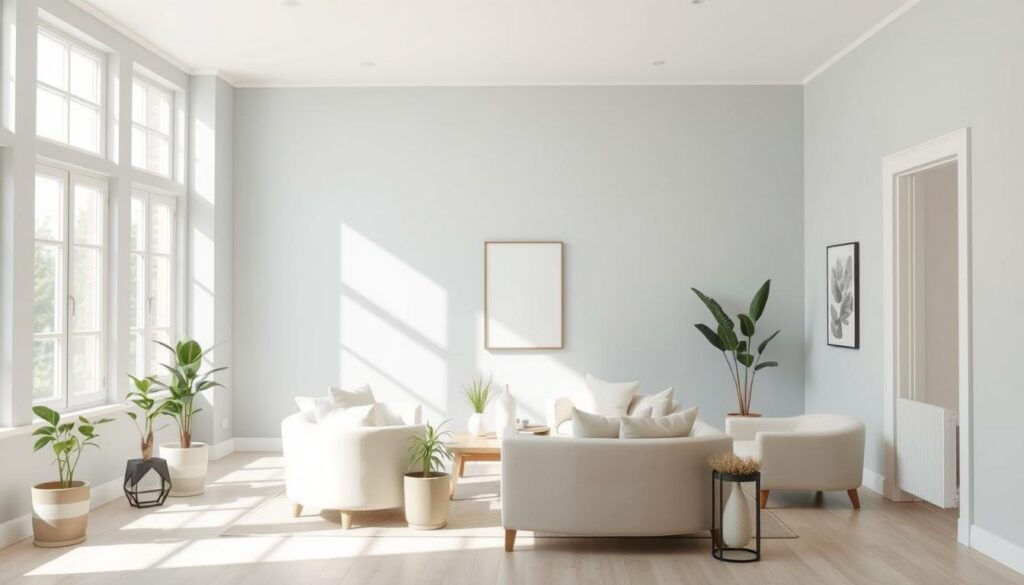
Best Paint Colors for Living Rooms
The living room is the heart of any home. The right paint color can make it welcoming. Think about the look you want and how it will match your furniture and decor.
We’ll look at three great paint colors for living rooms: timeless grays, inviting earth tones, and bright shades. Each offers unique benefits for a beautiful and functional space.
Timeless Grays
Grays are popular for living rooms because they’re neutral. They go well with many decorating styles. You can find a gray for every taste, from soft to deep.
- Soft Grays: These create a calm atmosphere. They pair well with pastel colors and simple decor.
- Charcoal Grays: For drama, charcoal grays add depth. They look great with bold colors.
Inviting Earth Tones
Earth tones warm up a living room, making it cozy. They’re inspired by nature, from terracotta to moss. These colors bring a welcoming feel.
“Earth tones make a room feel grounded and welcoming. They’re perfect for a cozy space that invites relaxation and conversation.”
| Color | Description | Best Paired With |
|---|---|---|
| Terracotta | Warm, earthy red tone | Natural wood furniture, green plants |
| Sienna | Rich, reddish-brown hue | Leather furniture, warm metallic accents |
| Moss | Soft, greenish tone | Natural textiles, earthy ceramics |
Bright and Airy Shades
For a light feel, choose bright shades. They make rooms feel larger and more open. Great for small rooms or those with little natural light.
Popular bright shades include:
- Creams: Soft, creamy white that adds warmth without being too much.
- Pale Blues: Calming and serene, creating tranquility in the room.
By picking the right paint color, you can make your living room beautiful and inviting. Whether you like grays, earth tones, or bright shades, the right color can transform your space.
Ideal Colors for Bedrooms
The right bedroom paint color can turn the space into a calm retreat. When picking home interior paint colors for bedrooms, choose shades that help you relax and feel serene.
The bedroom is a place of peace, and the right paint color can make it even better. Let’s look at some colors that can make your bedroom a cozy haven.
Calming Blues
Blues are known for their calming effect. Light sky blue or soft navy can make your bedroom a peaceful place for sleep.
Soft blues also make a room feel bigger and more open. This can help you relax even more.
Soothing Greens
Green is a calming color that brings balance to the bedroom. Soft mint to sage greens create a natural and calm space.
Greens also help reduce eye strain and promote relaxation. They’re great for bedrooms.
Warm, Cozy Neutrals
If you like a neutral look, warm, cozy neutrals like beige, taupe, or soft gray are perfect. They make your bedroom feel welcoming and inviting.
These colors work well with many furniture styles and decor. They’re perfect for a timeless bedroom look.
| Color Category | Popular Shades | Benefits |
|---|---|---|
| Calming Blues | Light Sky Blue, Soft Navy | Promotes relaxation, creates a sense of calmness |
| Soothing Greens | Soft Mint, Sage | Brings balance, reduces eye strain |
| Warm, Cozy Neutrals | Beige, Taupe, Soft Gray | Creates a comforting atmosphere, versatile |
By thinking about these colors and how they affect our mood, we can pick the best paint for our bedrooms.
Dining Room Color Choices That Impress
Turning your dining room into a stylish space begins with the right paint color. This room is where memories are made. The right color can leave a lasting impression. Think about the mood you want to create.
For a dining room that feels luxurious and sophisticated, here are some color options:
Rich Jewel Tones
Jewel tones like emerald green, sapphire blue, and ruby red add drama. These rich colors make the room cozy and perfect for special events. Pair them with neutral furniture and decor to balance the boldness.
Warm Reds and Oranges
Warm reds and oranges bring energy to your dining room. They spark conversation and appetite, great for dinner gatherings. Combine them with earthy tones and natural textures for a harmonious look.
Elegant Whites
For a subtle, elegant vibe, use whites and soft creams. These colors make the room feel larger and more open. Elegant whites also set a clean backdrop for your furniture and decor.
When picking a paint color, also think about the cost of painting your home’s interior. For more on this, check out our article on how much it costs to paint your home’s interior.
Important things to consider when choosing a dining room paint color include:
- The color of your dining furniture and decor
- The natural lighting in the room
- The overall style and ambiance you want to achieve
By thinking about these factors and picking a color that fits your dining room, you can make a space that’s both stunning and practical.
Kitchen Paint Colors to Inspire
A good kitchen paint color can make your space feel welcoming and useful. The kitchen is where meals are made and memories are created. Choosing a paint color that fits your kitchen’s style is key to a cozy atmosphere.

Crisp Whites and Creams
Timeless choices for kitchen paint are crisp whites and creams. They make the space feel clean and open, making it look bigger. These colors also match many kitchen styles, from modern to classic.
- They reflect light, making the kitchen brighter.
- They provide a neutral background for kitchen decor.
- They are easy to pair with different cabinet and countertop colors.
Energetic Yellows
Energetic yellows can add warmth and energy to your kitchen. This bright color boosts creativity and appetite, ideal for a kitchen where meals are made.
- Yellow makes a kitchen feel welcoming and cheerful.
- It’s a great color for accent walls or kitchen islands.
- Different shades of yellow can complement various kitchen styles.
Modern Blues
Modern blues bring sophistication and calm to kitchen paint colors. From soft sky blues to deep navy, blue adds elegance and serenity to the kitchen.
- Blue creates a calming atmosphere in the kitchen.
- Darker blues add depth and sophistication.
- Lighter blues make the space feel more spacious.
When picking a kitchen paint color, think about your home’s style and decor. A color that matches your kitchen’s unique features makes it both beautiful and practical.
Bathroom Paint Color Ideas
Choosing the right paint color for your bathroom can make it a cozy retreat. The perfect shade can enhance your bathroom’s look, making it feel like a spa. This can refresh both your body and mind.
Refreshing Aqua and Turquoise
Aqua and turquoise colors bring a calming vibe to your bathroom. They remind you of a peaceful ocean, adding tranquility to your home. For more ideas, check out bathroom design ideas that feature these colors.
Soft Grays and Whites
Soft grays and whites are classic choices for bathroom paint. They offer a clean, elegant look. These colors match many decorating styles and provide a nice background for your bathroom’s fixtures.
Bold Accent Colors
For a bold look, consider using deep blues, rich greens, or vibrant yellows. These colors can make a statement and draw attention. But, pair them with neutral shades to keep the room balanced.
| Color Scheme | Description | Ideal For |
|---|---|---|
| Aqua/Turquoise | Refreshing and calming | Coastal or beach-themed bathrooms |
| Soft Grays/Whites | Timeless and elegant | Modern or traditional bathrooms |
| Bold Accent Colors | Dramatic and vibrant | Bathrooms needing a focal point |
Experts say the key to a stunning bathroom is in the details. Picking the right paint color is just the start. Think about the interior design color palette and trending interior paint colors to create a space that feels welcoming.
“The right color can transform a bathroom into a personal spa, making it a haven of relaxation and rejuvenation.”
When picking paint for your bathroom, think about the lighting, fixtures, and the look you want. The right color can turn your bathroom into a peaceful oasis you’ll enjoy.
Creating Cohesion with Color Schemes
Color schemes are key in home design, making spaces feel welcoming and connected. A good color scheme can link different rooms, making your home feel like one big space.
Understanding Color Palettes
A color palette is a set of colors for your home, creating a unified look. Start by thinking about the mood you want. For a calm feel, choose blues and greens. Neutral tones like beige or gray work well with many colors.
Think about your home’s natural light when picking colors. Colors look different in different lights, so test them at various times.

Using Accent Walls
Accent walls add interest to a room while keeping the color scheme consistent. Paint one wall a bold color to create a focal point. This works well in living rooms and bedrooms.
Choose an accent wall color that complements the room’s colors and furniture. For example, a deep, rich color looks striking against light walls.
Matching with Furniture
Matching your color scheme with furniture is crucial for a cohesive look. It’s not necessary for everything to match the walls, but they should work together. Think about your furniture’s colors when picking paint.
If you have a bold piece of furniture, like a colorful sofa, choose wall colors that enhance it. Or, if your furniture is more subdued, use bolder wall colors to make a statement.
Tips for Testing Paint Colors at Home
Finding the perfect paint color starts with thorough testing at home. When picking home interior paint colors, it’s not just about liking the color. It’s about making sure it fits your space well.
Start by using sample paints. Brands like Benjamin Moore offer small sizes of their paints. You can buy these samples and test them on your walls.
Using Sample Paints
Testing sample paints is simple but takes time. Pick a few top-rated interior paint colors you like. Then, paint each color on a different wall section.
Observing Colors in Different Lighting
It’s crucial to see how colors look in different lights. Natural, artificial, and time of day can change how a color appears. Notice how the color changes under various lights.
For example, a color might look great in morning light but change at night. This helps you see if the color stays the same or shifts too much.
Documenting Choices
Keep track of your color tests. Take photos of colors in different lights and times. You can also jot down your thoughts in a journal or app.
By documenting, you can easily compare colors. This helps you choose the best interior paint color trends for your home.
Maintenance and Durability of Paint Colors
A well-maintained paint job can make your home’s interior look and feel better. When we pick home interior paint colors, we’re choosing more than just a color. We’re investing in the look and lasting quality of our homes.
Choosing High-Quality Paints
The quality of paint matters a lot for its durability. High-quality paints last longer and keep their color and finish. Look at the paint’s finish, ingredients, and if it’s right for the room (like moisture levels in kitchens).
Choosing popular home interior paint colors from known brands is a smart start. These paints are made to last and come in many colors for different interior color schemes.
Understanding Finish Types
The finish of your paint affects its look and how long it lasts. You’ll find finishes like flat, eggshell, satin, semi-gloss, and high-gloss. Each has its own benefits and is best for different parts of the house. For example, glossy finishes are durable and easy to clean, great for kitchens and bathrooms.
Longevity and Upkeep
To keep your paint looking good, regular care is essential. Clean walls gently, fix stains or marks quickly, and touch up thin spots. This way, your home interior paint colors stay bright and your home welcoming.
Knowing about paint quality, finish types, and upkeep helps homeowners have a beautiful, lasting paint job. It makes their home’s interior better for years.
Final Thoughts on Home Interior Paint Colors
Choosing the right colors for your home can make it a cozy space that shows off your style. Think about the look you want and the mood you want in each room. This will help you pick the perfect colors.
Personalizing Your Space
It’s important to pick colors that match your style. You might like the latest trends or classic colors. Your home should show off your taste. Try to pick colors that work well together in different rooms for a unified look.
Research and Exploration
Doing your research is key. Try out different colors and test them on your walls. This way, you’ll find the best colors for your home that fit your life and taste.
Embracing Change
Changing your home’s colors can be exciting. As new trends come along, you can update your colors. This makes your home look great and can even increase its value.

