Did you know that the colors in your interior spaces can really affect your mood? They also change the feel of your home. Picking the right paint colors is more than just a personal choice. It’s about making a space that feels welcoming and shows off your style.
We think the right painting color ideas can make a big difference in your living areas. In this article, we’ll share our favorite interior paint colors to make your home look better. Whether you want to update one room or your whole house, we’ll help you pick the best colors.
Key Takeaways
- Understanding the impact of color on mood and ambiance
- Exploring the latest trends in interior paint colors
- Tips for choosing the perfect color palette for your home
- How to balance personal style with timeless design
- Common mistakes to avoid when selecting interior paint colors
1. Understanding Color Psychology in Interior Design
Colors can change how our homes feel, making color psychology key in interior design. The colors we pick can really affect our mood, feelings, and health.
Emotional Impact of Colors
Different colors make us feel different ways. For example, blue makes us feel calm and peaceful. On the other hand, red can make us feel energetic and passionate. Knowing how colors make us feel is important for a cozy and useful home.
Here’s a quick look at some common colors and their effects:
| Color | Emotional Impact |
|---|---|
| Blue | Calmness, Serenity |
| Red | Energy, Passion |
| Green | Balance, Harmony |
| Yellow | Happiness, Optimism |
The Role of Lighting in Color Perception
Lighting changes how we see colors. Natural light, artificial light, and light direction all play a part. For example, a color might look bright in sunlight but different under artificial light.
Choosing Colors for Different Rooms
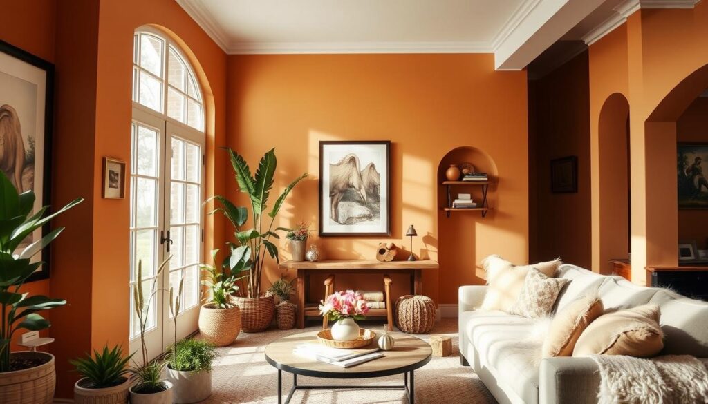
Different rooms have different uses, and colors should match. For example, soothing colors like light blue or pale green are good for bedrooms to help us relax. On the other hand, stimulating colors like orange or yellow are better for kitchens and dining areas to make us want to socialize and eat.
When picking colors for your home, think about the room’s purpose, the light it gets, and the look you want. This way, you can make a space that feels welcoming and supports your life.
2. Popular Interior Color Trends for 2023
2023 is bringing new color trends to interior design. These colors promise to change how we see our homes. From calming neutrals to bold statements, there’s something for everyone.
Soft Neutrals and Earthy Tones
Soft neutrals and earthy tones are still popular. They bring a calming, natural feel to any room. Beige, taupe, and soft gray are popular home painting colors for a serene vibe.
For more on choosing the right paint colors, check out our guide on the best home interior paint colors.
Bold and Vibrant Colors
Bold and vibrant colors are making a big impact in 2023. Deep blues, rich greens, and bright yellows add energy and personality. These home wall painting ideas can make a bold statement.
Pastel Shades for a Calm Ambiance
Pastel shades are also trending for their calming effect. Light pinks, baby blues, and mint greens create a peaceful space. They’re perfect for bedrooms and nurseries.
In conclusion, 2023 has a wide range of color trends. Whether you prefer soft neutrals, bold colors, or pastel shades, there’s something for everyone. These trends are sure to inspire your next home decor project.
3. Creating a Cohesive Color Palette
Creating a cohesive color palette is key to a visually appealing interior space. A well-designed color scheme can tie together different elements of your home. It creates a harmonious environment that reflects your personal style.
Selecting a Base Color
The first step in creating a cohesive color palette is selecting a base color. This color will be the foundation of your design. It influences the choice of other colors. When choosing the right interior paint colors, consider the mood and atmosphere you want to create in your home.
For a calming atmosphere, soft neutrals like beige or light gray are ideal. For a more vibrant look, consider bold colors like navy blue or emerald green. The key is to choose a color that resonates with your personal taste and complements the architectural style of your home.
Adding Complementary Shades
Once you have your base color, the next step is to add complementary shades. These are colors that, when used together, create a visually appealing contrast. For example, if your base color is a cool blue, complementary shades could include warm neutrals like beige or soft orange.
To ensure harmony, use a color wheel to identify complementary colors. This tool can help you visualize how different colors interact. It makes it easier to select shades that work well together.
Balancing Dark and Light Hues
Balancing dark and light hues is crucial for a cohesive color palette. Too much of either can make a room feel overwhelming or washed out. A general rule of thumb is to use the 60-30-10 rule: 60% of a dominant color, 30% of a secondary color, and 10% of an accent color.
| Color Element | Percentage | Description |
|---|---|---|
| Dominant Color | 60% | Base color that sets the tone for the room |
| Secondary Color | 30% | Complementary color that adds depth |
| Accent Color | 10% | Bold color used to create visual interest |
By following this rule and considering the best paint colors for residential interiors, you can achieve a balanced and harmonious color scheme. This enhances the beauty of your home.
4. Using Accent Walls to Enhance Space
Creating an accent wall is a great way to add color and focus to a room. It can make a room look bigger or more cozy, depending on the color and style. This technique is a key part of home interior painting inspiration.
Choosing the Right Wall for Accent Colors
Picking the right wall for an accent color is key. Look for the wall that naturally catches your eye. This might be behind a fireplace, a big piece of furniture, or a staircase. Think about the room’s layout and where people tend to go to find the best spot.
Also, consider the room’s color scheme. An accent wall that matches the room’s colors can bring harmony. But, a bold, different color can add energy and excitement.
Techniques for Creating an Accent Wall
There are many ways to make an accent wall, from simple painting to more detailed designs. Here are a few popular methods:
- Painting: The simplest way is to paint the wall a different color than the others. You can choose a bold color or a deeper shade of a room color.
- Wallpaper: Adding wallpaper to one wall can add texture and pattern, making a unique focal point.
- Stenciling: Using stencils can add a creative touch, allowing you to add patterns or designs to the accent wall.
Popular Accent Colors to Consider
Choosing the right color for your accent wall depends on the room’s purpose, the existing colors, and your taste. Here are some popular colors to think about:
| Room Type | Popular Accent Colors |
|---|---|
| Living Room | Deep blues, rich greens, warm neutrals |
| Bedroom | Soft pastels, muted berry tones, soothing grays |
| Kitchen | Bright yellows, vibrant reds, crisp whites |
5. Timeless Color Combinations for Any Home
Choosing timeless color combinations can really make your home look better. These colors are not just trendy; they create a welcoming space that lasts. They make your home feel harmonious and inviting.
Let’s look at some classic color pairs that can make your home look great. These colors are elegant and fit many decorating styles.
Classic White and Gray
A white and gray color scheme is always in style. It’s sophisticated and gives a clean look. The contrast between these colors makes rooms feel bigger and more open.
Benefits of White and Gray:
- Creates a calm and serene atmosphere
- Works well with many decorating styles
- Makes rooms seem larger
Rich Jewel Tones and Metallics
For a luxurious feel, try rich jewel tones with metallics. Emerald green, sapphire blue, and ruby red look amazing with gold or silver. This adds luxury to any room.
| Jewel Tone | Metallic Accent | Room Impact |
|---|---|---|
| Emerald Green | Gold | Luxurious and sophisticated |
| Sapphire Blue | Silver | Cool and modern |
| Ruby Red | Gold | Warm and inviting |
Earthy Greens and Warm Browns
Earnthy tones are great for a cozy home. Mixing earthy greens with warm browns brings nature inside. This makes your home feel more grounded and cozy.
Tips for Using Earthy Tones:
- Use different shades of green for depth
- Pair greens with warm browns for a natural look
- Add wood and stone for more earthiness
Using these timeless color combinations can make your home beautiful and welcoming. Whether you like classic elegance or bold luxury, there’s a color scheme for you.
6. Room-by-Room Color Suggestions
Let’s dive into popular home painting colors for each room. Different rooms have different uses, and the right colors can change how they feel and work.
Living Room Color Ideas
The living room is where we spend time with loved ones. Choose warm, inviting colors to make it cozy. Soft neutrals like beige or gray can make it calm. Bold colors like navy blue or emerald green can add elegance.

Bedroom Color Inspirations
Bedrooms are our retreats for rest and relaxation. Colors like light blue or pale lavender can help you sleep better. For a luxurious feel, try rich jewel tones like sapphire or amethyst.
Kitchen and Dining Room Trends
Kitchens and dining rooms are for sharing meals and making memories. Pick colors that are welcoming and easy to clean. Crisp whites and warm woods are great choices. For a bold look, deep reds or sunny yellows can bring energy.
Choosing the right colors for each room can improve both looks and function. Whether you want to relax, have fun, or get inspired, the right colors can make a big difference.
7. The Impact of Size on Color Selection
Knowing how room size affects color choice is crucial for the right feel at home. The size of a room greatly influences the paint colors you pick. It can make a space feel bigger or more cozy.
Small Spaces: Light and Airy Colors
In small rooms, light and airy colors are key to making them look bigger. White, cream, and pale gray can make a room seem more spacious and bright. These colors also reflect light, making the space feel open and less cluttered.
Stay away from dark colors in small spaces, as they can make the room feel tight and closed in. If you want to add color, try pastel shades or soft hues on one wall. This adds interest without overwhelming the space.
Large Rooms: Bold Colors to Define Areas
Large rooms give you more freedom in choosing paint colors. You can use bold and vibrant colors to separate different areas in the room. This creates a sense of separation and makes the room more functional.
In an open-plan living area, use a different color for the dining area to set it apart from the living space. This helps create separate zones in the larger room, making it more organized and functional.
When choosing the right interior paint colors for large rooms, think about the look you want. You can mix light and dark shades for a balanced look. For example, painting the ceiling a lighter shade than the walls can make it seem higher, adding to the room’s spaciousness.
The best paint colors for residential interiors are those that match your style and the room’s size and layout. By considering the room’s size and the effect you want, you can pick colors that enhance the space and make it welcoming.
8. Incorporating Patterns and Textures
To make your home stand out, it’s key to know how to use patterns and textures. This not only adds depth but also makes your space more interesting.
Using Wallpaper with Color
Wallpaper is a great way to bring patterns into your home. Pick a wallpaper that matches your room’s colors. A bold pattern can make a room modern, while a soft design adds elegance.
Here are some tips for using wallpaper effectively:
- Select a wallpaper that complements the room’s color palette.
- Consider the room’s purpose; for example, a calm pattern for bedrooms and a more vibrant one for living areas.
- Don’t be afraid to mix patterns, but ensure they share a common color to maintain cohesion.
Textured Paints for Added Depth
Textured paints add a new dimension to your walls. They make your walls more interesting. You can choose from subtle textures to bold, three-dimensional patterns.
Some benefits of using textured paints include:
- Adding depth and visual interest to plain walls.
- Creating a unique, personalized look for your home.
- Concealing minor wall imperfections.
Combining Patterns with Paint Colors
When mixing patterns with paint colors, balance is key. You can pair bold patterns with neutral colors or vibrant colors with subtle patterns. The goal is to make your space look good and feel right.
Here are some strategies for combining patterns and paint colors effectively:
- Start with a neutral base color on the walls and add patterns through furniture or wallpaper.
- Use a bold paint color on one wall and balance it with a simpler pattern on adjacent walls.
- Experiment with different textures and patterns to find a combination that works for your space.
By adding patterns and textures thoughtfully, you can make your home more engaging. It will show off your personal style.
9. Sustainable and Eco-Friendly Paint Options
Homeowners are now more aware of the environment. They want paints that are good for the planet and their health. This change is big.
Eco-friendly paints look and feel like regular paints but are better for the earth. It’s important to check the VOC content of these paints.
Understanding VOCs and Their Impact
VOCs are chemicals that evaporate quickly. They can make indoor air dirty and harm our health. This can cause anything from mild irritation to serious health problems.
Reducing VOC exposure is key to a healthy home. Here are ways to cut down on VOCs:
- Look for paints that say low-VOC or VOC-free.
- Make sure your home is well-ventilated while painting.
- Follow the paint’s instructions for use and drying times.
The EPA says low-VOC paints help a lot. “Using low-VOC or VOC-free paints makes homes healthier,” an EPA person says.
Brands to Explore for Eco-Friendly Paint
Many brands now have eco-friendly paints. Some top ones are:
| Brand | Product Line | VOC Level |
|---|---|---|
| Benjamin Moore | Aura | Low VOC |
| Behr | Premium Plus ULTRA | Low VOC |
| Farrow & Ball | Estate Emulsion | Low VOC |
Benefits of Using Natural Paints
Natural paints have many good points. They:
- Make indoor air cleaner by having less VOCs.
- Are better for the planet because they’re made from natural stuff.
- Give a special look that makes rooms unique.

Choosing eco-friendly paints helps the planet and makes homes better. As we look for new ways to design homes, using sustainable paints is very important.
10. Seasonal Color Changes for Your Home
As seasons change, your home’s colors can too. This keeps your interior design fresh and exciting. By changing your home painting color ideas interior, your home stays current and inviting all year.
Adapting Colors with the Seasons
Changing your home’s color scheme with the seasons is more than just painting walls. It’s about creating a mood that matches the season. For example, spring calls for lighter, brighter colors that reflect renewal. Winter, on the other hand, is perfect for warmer, cozier tones that make your home a cozy retreat.
Best Colors for Fall and Winter
For fall and winter, warm colors are key. Orange, red, and yellow evoke autumn leaves. Icy blues and grays bring the chill of winter. Use these colors in paint, throw pillows, and blankets to create a color schemes for home interiors that feels seasonal.
One interior designer says, “Seasonal colors keep your home fresh and updated without big renovations.” You can add seasonal colors with a few accent pieces or paint an accent wall.
Refreshing Your Home for Spring and Summer
Spring and summer are perfect for lighter, brighter colors. Pastel shades, soft whites, and sunny yellows make spaces feel open and airy. Refresh your home’s exterior with colors that match the season’s blooming flora.
- Use paint samples to test colors before committing to a specific shade.
- Incorporate seasonal colors through accessories like throw pillows and vases.
- Consider the natural light in your home when choosing seasonal colors.
Embracing seasonal color changes keeps your home’s interior design lively and engaging. Whether it’s small changes or a big renovation, the right colors make a big difference. They create a welcoming and comfortable living space.
11. Working with Professionals for Color Consultation
If you’re not sure about the right colors for your home, consider a professional interior designer. They offer valuable insights and guidance on choosing the right interior paint colors.
Professionals can help in many ways. They can pick popular home painting colors that match your style. They also ensure the colors look good and work well.
Benefits of Hiring an Interior Designer
Interior designers bring many benefits to your painting project. They know how to pick colors that match your home and style. They also have access to products you might not find elsewhere.
- Expert knowledge of color theory and trends
- Access to a wide range of paints and finishes
- Ability to create a cohesive look throughout your home
Tips for Effective Collaboration
To make the most of working with an interior designer, communicate well. Share your ideas, preferences, and budget. This helps them understand your vision and offer the best advice.
Here are some tips for working well together:
- Clearly define your project goals and objectives
- Provide reference images and examples of styles you like
- Be open to their suggestions and ideas
Questions to Ask Before Starting
Before starting, ask your designer some questions. This ensures you’re both on the same page. Some questions to ask include:
- What is your experience with projects similar to mine?
- Can you provide examples of your previous work?
- How will we communicate throughout the project?
By working with a professional interior designer and following these tips, you can get a beautiful and functional color scheme. This will enhance your home’s value and appeal.
12. Final Thoughts on Choosing Colors for Your Home
Choosing the right paint colors for your home is a personal and creative journey. It’s important to try out color samples before making a final choice. This can greatly impact the mood of your space.
Trying Out Samples
Test colors on your walls before painting the whole room. This helps you see how the color looks with the room’s lighting and design. It ensures the color you choose will enhance your space as you imagined.
Personalizing Your Space
Your home’s colors should show off your personal style. Think about what you like, your lifestyle, and the look you want. This way, your home will truly feel like yours.
Timeless Choices
Consider colors that will last over time. Choose shades that won’t quickly go out of style. This way, your home will stay beautiful and welcoming for many years. You’ll create a space that is both inspiring and lasting, capturing the essence of home interior painting inspiration.

